Saturday, April 24, 2010

Custom Pendant Design Update

Hello Jewelry Aficionados!

Here are some photos showing the process I used to create the pendant I designed in the last post.


This first one shows the pattern cut out of paper and laid on the silver sheet. I then used a fine point Sharpie Marker to transfer the design. Then, so the design wouldn't be lost with finger smudges, I took an awl and scored along the line, making a permanent mark in the sterling.


I then carefully cut out the shape using a jeweler's saw. I'm always surprised by how quickly this process actually takes. One would think that it would take lots of time and several saw blades, not to mention sore hands, but since sterling is relatively soft, it cuts right through.


The piece as soon as it is free. You can see where I started each of the cuts. Try to keep these to a minimum, as you can see there is extra metal that now has to be filed away (and wasted) at each of those points (the bottom especially).


After using my handpiece with green stones and white rubber wheels along with a variety of different files, here is the smoothed piece, ready to be knocked around a bit with my hammer. Right now it is very 2-D, and the design calls for a more 3-D shape, so I need to not only hammer in the texture, but I need to form it into a rather complicated curve.


I say complicated curve because each one of the arms is curved and domed, as is the piece as a whole. I ended up hammering on my former models as well as an old 2x4, working to end up with the *PERFECT* shape.


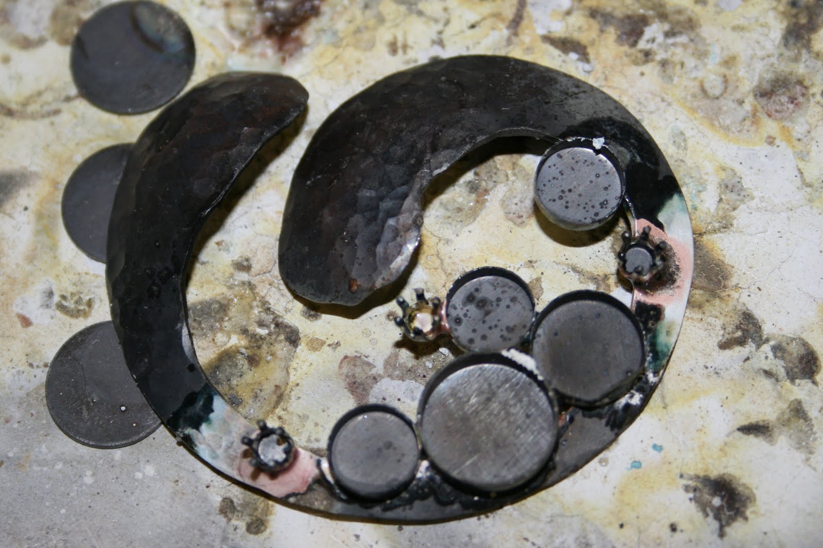
The next step involved soldering on all the settings for the stones. I used premade settings. There are three sizes of bezel cups, and 3 snap settings for 4mm CZ's. The trick was to set them successfully without melting the cups. Since the pendant base is large and relatively thick, it acts as a pretty significan heat sink, so it has to be heated thoroughly before any flame is directed onto the settings, or they will melt in no time.


After a couple of hours in the pickle pot, the oxidation from the soldering process is gone, leaving a matte finish . It's now ready to set the stones.


The onyx cabochons are set in their cups waiting to be set. The edges of the bezel cups had to be shortened somewhat so that there wouldn't be a lot of metal showing. Also, since I used high-domed cabochons, they were pretty steep, which would have made it difficult to bend/fold over that much metal without it creasing on itself and looking unsightly.


After a nervewracking afternoon of cutting, setting, and a whole lot of polishing (I heard somewhere that the amount of time spent on polishing usually ends up being equal to the amount of time spend on everything else. I agree.), the pendant ended up a success. Next step? The earrings.
Stay tuned.

Peace! Pastel Guy


Tuesday, March 2, 2010

Jewelry Commission Part I - Design

Untitled Pendant Design

Coordinating Earrings

About a month ago, I was approached by a woman in town looking for a unique gift. "Make it big and bold," she said. "Can you do that?" Are you kidding? I LOVE making big and bold. My opinion is that if you're going to bother wearing jewelry, then WEAR it! FLAUNT it! Don't be shy and put on something that no one is ever going to notice. The whole point of wearing jewelry, of collecting jewelry, of making jewelry, is for people to notice it; otherwise, why bother?

But I digress.

The first part of a creative project is to find inspiration. This time, inspiration came during my son's haircut. I had just told the stylist to take a #2 up the back and sides and scissor the top so he could still spike it. Then I noticed her earrings. Big. Bold. (And nothing like the design, above.) All of a sudden, I saw this design in my head. This is it! All those partial, foggy ideas which had been popping in and out of my head suddenly coalesced into this design. It was one of those weird, creative epiphanies you read about but seldom experience.

Next, I drew the piece to size. The pendant measures about 2.25 inches (5.5 cm) in diameter, and the earrings are as big as a US quarter dollar. It's sterling silver, formed to give it some depth, and hammered at the ends to give it some texture. Then it will be set with 8mm, 10mm, and 12mm onyx cabachons (since black is 'her color'), and 4mm CZs (since real diamonds are not even an option).

I plan to put an inscription on the back, too, but I can't tell you what it is, yet, as the recipient might guess, and that would be bad.

The earrings are pretty much the same, except the piece with the post will be a 12mm cabachon onyx. I'm thinking I may start with 12 guage wire rather than cutting out sterling sheet, too.

The shape is meant to symbolize protection, nurturing, and caring. The arms could be human arms protecting children, the walls of a pod protecting its seeds, or the petals of a flower protecting the stamens.

I'm excited to start contructing this piece, and I plan to keep posting photos as I progress, so stay tuned!


Pastel (and Jewelry) Guy


Monday, February 15, 2010

Where Am I..?

Wow. No new art to share. Sorry.

I haven't even been making any jewelry! There are several factors on which I would like to place blame (after all, it's only human to place the blame elsewhere besides yourself!).

First, Facebook. That is an evil, evil place. When I left home all those years ago, I RAN as fast as I could. Now I've reconnected with high school and college friends, and it's been really comforting to learn that our lives are a lot different, yet we are still friends after decades of not talking.

Second, New Job. Being an Assistant Principal has a steep learning curve, one that I'm trying my best not to fall off. The take home work isn't so bad, but the extra time a school sure is!

Third, Lack of Desire. I just haven't been motivated. I think it may be that I'm actually happy with my job now, and not trying to start a second career while still in my first.

I do have a Plan, however. It involves a solo canoe trip this summer. Just me, the wilderness, and some art supplies for a week. It's not a fully formed plan, but I'm thinking a journal of some sort. Pastels may not be practical, so I may dust off my watercolors...

If anyone has some good ideas, please let me know!

PastelGuy

Tuesday, September 22, 2009

Summer Rhythms

Summer Rhythms
14" x 11" pastel on paper

Whew! With the new job of Assistant Principal, my quantity of free time over the summer plummeted. Thanks to all of you who have kept on, occaisionally asking where I am...

The above painting is the third one I've done in 2009. And since I've decided to keep the focus of my blog on my art, well, that's why posts are a little far and few between. The motivation for this work came from the gallery in St. Louis where I show my work, Gallery M. Susan, the nice owner over there decided for a juried show this fall called 'Beauty Is...'. I needed to get her some new work, so I went over to Tower Grove Park in St. Louis where they have gorgeous tropical waterlily ponds, and I took a bunch of pictures. One photo ended up on my laptop as wallpaper. Perhaps that can be a future post. We can put it up as a sort of challenge. What do you think?

This is actually a small part of a much larger picture of white waterlilies. When i went to print off the whole file, it only showed this much. I was just about to delete the print job, when the composition struck me, and I was intrigued by the water, the curves of the pads offset by the straight lines of the stems. One person told me that it was too dark, but I like using my darkest pastels, sometimes.

This was the first painting where I used Mineral Spirits to create an underpainting. I painted the water a very dark green/brown, and the leaves a yellow ochre. If i were to do it again, I think I would choose complementary colors instead. I think some red or orange showing through the leaves would be striking.

Until next time, when I'll let you know how the Gallery Opening does this Friday evening...

Pastel Guy


Sunday, July 5, 2009

Finally Finished!

OK, so it's not a painting, but it's what's been consuming my life for the past week. Literally. Picture this same room with dark teal green carpet and ugly peachy walls, and a ceiling that wasn't quite white. Now look at the white ceiling, the 'Plateau' walls, and the *new* bamboo wood floor installed by yours truly.

I know the paintings are off center, but we moved the sofa and chairs around after the move-back-in, and I haven't re-moved the pictures. Besides, I think they'll go to my office after I paint a 30 x 80-inch painting for over the sofa.

Until next time...

Pastel Guy

Thursday, April 23, 2009

I Did It!


Morning Work pastel on panel 16" x 20"

Wow! It's been forever since I've posted. A lot has gone on... a new job for me and my wife for the 2009 - 2010 school year. I'll be the Assistant Principal for my building,, and she'll be Director of Curriculum, Instruction, and Assessment for her district.

And I've done one painting in the last month and a half. It started out as a challenge photo for the Yahoo! pastel group I joined:

photo by Marilyn Witt

The black and white sketch that drew in my notebook turned out much better than the finished painting, I think. Once I had the daffodils drawn in, the vase looked to big for the flowers. I think it was the distance between the bottom of the bouquet and the place on the counter where i wanted it to sit was too far, so I had to change the style of vase. OK. Then it looked really blank, so I added my favorite coffee mug. It still looked empty, so I added the scissors. Then I made the mug bigger, since I really don't drink out of demitasse. All in all, it was intended to be a quickie, so the proportions aren't quite right, but I do like the lightness and airiness that it has.

Comments?

Pastel Guy


Sunday, March 1, 2009

OK, OK Already!

Sunrise on St. Mary's - 24 x 18" pastel on paper
I can tell everyone is getting antsy for a new painting. I've lost subscribers to my blog, and no one is emailing me anymore.
Well, here y'go. After a rather length vacation (yes, the project is finished - thank goodness!), I'm back at my easel.
The photo for this picture came from a fellow Etsy artist's blog. This picture presented some challenges. The biggest hurdle was keeping the waterfall and the surrounding rocks in a dark enough value range that the sunshine would be dominant. The original photo only had a hint of sun at the very top (and hardly any of the trees), so I had to make up the rest.
This painting is a good example of how a color can look differently depending on what it's background is. The sun highlights on the rocks to the right are actually a light orange color, but on the purple, they, too, take on a purple color - weird, huh?
I'm going to let it sit on my mantelpiece downstairs for a few days until I sign it. If you see anything that needs adjusting, let me know!
Thanks,
Pastel Guy
www.matthewweld.com - pastel paintings
www.studio206.etsy.com - handmade jewelry for sale

Monday, February 23, 2009

Oh Yeah...


It's done!

The bath/bedroom project is officially complete! Last night was our first night back in our bedroom. It felt like we had moved into a new house. It turned out so well that I am so proud of myself I can hardly stand it! I figure I spent 28 long days (divided into weekends and days off) on the project. I can understand now why Habitat for Humanity requires the future inhabitants to work on their homes. All of a sudden I have a vested interest in my abode, and and am even more proud to be its inhabitant.

The picture above is of the bamboo floor before we started moving everything back in. At first the color variation in the wood was a tad disturbing, but as the pieces started accumulating, the overall effect was very pleasing.

Now that we have moved back into the bedroom and out of the dining room, my life should return to (somewhat) normal, and I can start posting more often again. I also plan to get back into the pastel quite heavily again. It's all a matter of priorities, and now that my shelter (one of man's 'needs') is back to normal, the rest of my life can continue as before.

Until next time!
Pastel Guy
www.matthewweld.com - pastel paintings
www.studio206.etsy.com - handmade jewelry

Wednesday, February 11, 2009

Sorry Folks!

OK, gotta put up a couple more of the bathroom remodel project. I know the trim isn't up and all, but the floor is grouted and finished, and the plumbing back in.


Here's the vanity and the light fixture - oh, and me taking the picture from our closet. We ended up putting in 4 medicine cabinets in place of one big mirror. We had a big mirror with two medicine cabinets (one on each side), but it was a pain to shave by going from close to far and back again. Besides, now we have all kinds of storage! The glass on the top of the vanity is the stack of shelves for inside the cabinets. Needless to say, we haven't moved in yet.


I have the equipment to put in the bamboo flooring reserved for the three-day weekend coming up. Then - finally - it's move-back-in time!


Cheers!


Pastel Guy
www.studio206.etsy.com - handmade jewelry

Saturday, February 7, 2009

Mosaic Fun


Here's a fun little toy I ran across on the Internet the other day. As I was searching for mosaic resources, I came across this site that offered premade mosaics to interior designers and builders. Having once been an interior designer (of sorts), I was immediately intrigued. Here you can use a virtual palette to create random mosaics out of square tiles. It's not what I would choose for my home, but I did have fun mixing colors. Try the Mosaic Maximizer and see for yourself!

Pastel Guy

http://www.matthewweld.com/ - pastel painting

Thursday, February 5, 2009

Some More Floor

So here's the final floor. Well, almost final. The grout isn't down yet in these pictures. But this shows all those little rectangular tiles from the old bathroom. The room in the top of the picture now also has tile in it, too. Putting down the tile was a lot like doing stained glass patterns. I enjoyed it so much that I ordered a book on Amazon about mosaic techniques. I have a grand scale design for the floor of the downstairs hallway brewing in the recesses of my brain.... I have a tendency to skip the baby steps and charge right in to the 'advanced' level projects.

My goal for this weekend is to finish the bathroom. The trim is painted and waiting to go back on. The vanity is in, the sinks put in, and the new faucets just need to have the last bit of hooking up to do. Then I do the real nailbiter and turn off the water, cut the existing pipes, and tap into them. Our goal when this project started was to have the project done for Valentine's Day. It looks as though the wood floors will be put down next weekend, with the moving in done on Presidents' Day. (I'm knocking loudly on my desk. Can't you hear it?!)

Cheers!
Pastel Guy
http://www.matthewweld.com/ - pastel paintings
http://www.studio206.etsy.com/ - handmade jewelry for sale

Monday, February 2, 2009

The Project from Hades

For the first time in oh, about three weeks, I don't feel totally burdened in the evening. I don't have any grading (this happens about twice each year in a teacher's life - at least mine), and I don't have a short project to do in my bathroom project. Therefore, here's the next installment on my project.


This photo shows the mess I created in the shower/toilet room by knocking out the tile. See those little rectagles? Remember them, because they will show up again later.


Then, in the main part of the bath,the vanity had been removed, and the plaster redone, and the flooring redone. This shows the wall before it was replastered. The hideous light fixture is now gone, and that soffitting is there to hold the new light fixture over the surface-mounted medicine cabinets that will stretch across the expanse. Turns out I actually had to make another step to cover the old light's hole in the ceiling. It was either that or redo the whole ceiling. The second step actually looks pretty cool.

Next time, I'll show you some quick photos of the tile floor with mosaic border (remember those little rectangles?), the new vanity, and the RED walls.

Until then,

Pastel Guy

http://www.matthewweld.com/ - pastels

http://www.studio206.etsy.com/ - handmade jewelry for sale

Wednesday, January 14, 2009

Zero is the Hero!

Humor me.

Even if you're not the artistic type (I know, there are some of you out there who are reading this), go ahead. Do it.

Just for fun, test the artistic eye within you, and take the hue test.

It's designed to see how good your eyes are at discerning color differences. This test gives you one hundred blocks in four sets, and you have to click and drag the boxes in order to put the colored squares in order. (Once you click on the site, find your country and click on it - I know it works for 'United States' at least!)

The results then let you see what colors you may have trouble seeing (or at least discerning). A score of zero is perfect. I suspect that most of you will score a zero - like me!

Pastel Guy
http://www.matthewweld.com/ - pastel paintings

Sunday, January 11, 2009

Room Painting Gone Haywire, part II

Part One, where the damaged studs and subfloor have been removed.


Part Two, where the studs and subfloor have been replaced.

Part Three, where it stands right now. The 5/8 inch composite board is over the top of the subfloor, the insulation has been added between the studs, and the vapor barrier stapled in. The level of the floor now matches the closet (where I'm standing to photograph), and the shower room (to the left). Unfortunately, the medicine cabinets we bought to span the 6 foot width are too wide by about a half-inch, so it's back to the drawing board for that. And I can't finalize the lighting requirements until the mirror situation is figured out...

Then, of course, I have a grand design for the tile forming in my mind. I just hope I'm not biting off more than I can chew. It should be like making a stained glass panel, right?

Until next time,
Pastel (and home remodeler) Guy
www.studio206.etsy.com - handmade jewelry for sale

Friday, January 9, 2009

Sleeping in the Dining Room

OK, I've been guilted into posting again. There are so many amazing blogs out there that I spend all my time reading instead of writing.

So here goes. There have been a lot of things happening on the home front that I just haven't found the gumption to put into words. But here goes. You asked for it (OK, not really, but you're reading it, right?!).


OK. Study the picture, above, and then answer the questions below.

See the ugly miniprint wallpaper?

See the black mildewy ickiness on the wall and the floor?

See where our bathroom vanity used to be?

Remember all these things as I relate the story. It all started when we decided to paint our Master bedroom. Easy, right? We have lived in this house for 7 years, now, and have been house poor until this year. We finally have some breathing room in our budget, so we have decided to finally take some of the extra $$ to make the necessary changes in order to make this house feel more like ours, rather than the previous owners'. (That, and we've both finished our Masters program, and so have all this extra time!)

Well, the walls had more of the ugly miniprint wallpaper pictured above. Fortunately, that came off in nice, tidy sheets. The glue, however, did not. So I tried scraping. Then I tried DIF stuff. Then I taped plastic over all the openings, donned a respirator, and used my sander. Fianlly, I gave up and replastered the whole thing. BTW, it looks great! I put a nice texture into it and painted it 'Toasted Wheat' per my wife's color preference (more on THAT later!).

Three days later...

Oh! Forgot to mention the trim. The people who built this house (1971) did it right, which is one of the reasons we bought it. Therefore, the trim in the bedroom consisted of baseboards, chair rail, and crown molding. The chair rail is off for good (anybody need some?!), and the crown molding went from dark brown stain to white (5 coats? Maybe? ...lost count). The base boards, however, were nailed on before the carpeting was laid down. Therefore, the tack strips were in front of the baseboards, necessitating the removal of the carpeting before the trim.

There I was, plastering the wall, singing along to the radio, when my wife calls in from the bathroom, "Uh, honey...?" Uh-oh. I walk into the bathroom, and she has pulled back the carpet under the bathroom vanity only to find a ring of WET (OK, very damp) subflooring in front of my sink. Long story short: the water pipes are in an exterior wall, and must have frozen some years ago when it was really cold during the winter, and had been slowly leaking since. Suddenly, what had been a 'one-of-these-days' project was now a 'yesterday!' project.

Out came my plumber's hat, and I cut out the old pipes and capped them off without incident. Since then, the floor has been drying nicely. Tomorrow, I will be taking out subfloor, sills, and studs and replacing them all. Wish me luck!

So, what had started out as a 3 gallons of paint project has turned into the 3 gallons of paint, lumber, tiles (more on THAT later, too!), solid bamboo flooring (I'm sure there will be a story there...), custom order vanity and top, plumbing supplies, and about a month of sleeping in the dining room.

Until later!
Pastel (and home remodeling) Guy
www.matthewweld.com - pastels
www.studio206.etsy.com - handmade jewelry

Monday, January 5, 2009

Guesting with Jellyfish

I am guest blogging today over at Dana Marie's Inspiration All Around Us blog. Every week, she posts a photo to inspire the Artist Within Us (naturally I'm intrigued). We then use that photo to creat some sort of art. In this case, I posted some sketches I made for sterling silver earrings.

Oh, and I have a thing for jellyfish.

Take Care,

Pastel Guy
www.matthewweld.com - pastel paintings
www.studio206.etsy.com - handmade jewelry
Don't forget to follow me on Twitter!

Tuesday, December 30, 2008

Champagne Celebration


In the spirit of New Year's celebrations, I listed my Champagne Collection on Etsy this morning. Made with gold filled wire with gold filled, vermeil, and brass beads in addition to citrine, several varieties and colors of freshwater pearls, and Swarovski crystal, this collection has been quite popular.
It all started when a high school senior approached me a couple of years ago to put together a necklace for her prom dress. The color was a greenish/goldish/creamish color that proved difficult to match at the mall. Fortuately, I love a design challenge, and came up with a collection of beads that blends well with all sorts of colors.
If you wear cream and khaki in the winter (doesn't most everyone?) and are looking for a way to add some sparkle, this is it.
Necklace is 48 inches (1.3 meters) and can be wound twice or three times for variety ($125).
Cuff is about 1.5 inches (3.8 cm) wide, and can be flexed to fit your wrist ($89).
Earrings hang 1.5 inches (3.8 cm) from your ear, and are on French wires, but could be put on ball/posts ($24). Sold separately, the set would be $238, but I'll give a special *blog pricing* at $225 (plus shipping of $5.00 in US - other places to be determined).
Happy New Year!
Pastel (and jewelry) Guy
www.studio206.etsy.com - handmade and custom jewelry
P.S. Don't forget to follow me on Twitter (see sidebar!).

Monday, December 29, 2008

Sunlight and Sycamores

As I went outside to retrieve the trash cans this afternoon, I stepped out into a beautiful late afternoon replete with long shadows and a brilliant blue sky. So I dropped the vacuum canister, ran inside, grabbed my camera, and came out for some low-angled light pictures to save for future reference. This one was my favorite. We have two acres, much of which is covered with trees that connect to about 50 more acres of trees behind us that will never (OK, probably never) be developed. Anyway, the sycamore trees with their whitish bark make cool designs against the blueblue sky of winter.

Water Lilies WIP (part I)

After my last posting, where I showed 4 pictures I was considering for my next painting, I chose one that had richer colors (thanks to photo editing software!) and a more panoramic view of the pond, although not as wide as the original. I kept asking myself, "What is the story I'm trying to tell with this picture?" The answer I came up with was that the painting would be about the pond of lilies, not just the lilies. That cut out the close-ups (those can be other paintings!). Because of the size planned for this piece (24 x 36 inches - about 67 x 100cm), there will be room on the panel for details in the indiviual plants. The trick will be to then not have the details be too busy. I might even write myself a big post-it that says, "SIMPLIFY!" and post it on my easel.

In the black-and-white sketch pictured above, I wanted to work out the composition, but more importantly the values. Since the original photo had many many shades of green, combined with reflections in muddy water, it was hard to tell what had a light value and which were darker. You can see by my notes in the margin that I notated where the lightest and darkest spots were.

I'll be posting as this work progresses. It's the largest pastel I've done, and since I'm on break, I have more time to be on the computer....Keep in touch!

Sunday, December 28, 2008

Decisions, Decisions

Hmmm.

It's time to start pastels up again, so I came back to the computer to find a suitable picture from all the photos I took over the summer. This year, I'm trying to be extra careful about not using pictures taken by someone else, since technically those are copyrighted. There are many competitions out there where I would be disqualified for using pictures taken by someone else.

So.

I'm trying to decide what my overall goal should be for next year. I've come up with several options:

1. Juried Art Shows
2. Juried Competitions
3. Local Galleries
4. Printed Material, like a 2010 calendar with a theme, such as 'waterways' since I like painting water.
5. Workshops in pastel

I suppose a sixth option would be to do all 5 of the above. I worked on the first three in 2008, and had great progress. In addition, I would really like to do pastel workshops all over the country, say at different art schools, like Arrowmont, La Conner Art Workshops , or the Scottsdale Art School. As a teacher and a painter, it's a great mix.

Any suggestions?

Pastel Guy
www.matthewweld.com - pastel paintings
www.studio206.etsy.com - handmade jewelry for sale